(This page is graphic intense and may take some time to load)

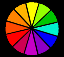
There are 12 basic colors in the color spectrum. The color wheel organizes them for better understanding of how color works.
![]()
 ........
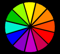
The order or the colors on the wheel is important. It doesn't matter which directions the colors are placed as long as they are lined up next to each other as you see here. Usually yellow is at the top of the color wheel but red or blue can be centered at the top as well.
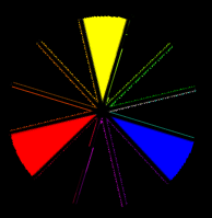 |
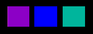
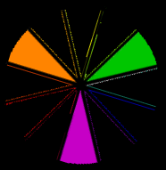
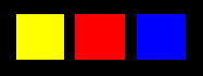
PRIMARY COLORS There are three primary colors which are yellow, red, and blue. All colors come from these three hues. Hue is another name for color. Notice how these colors are at an equal distance on the color wheel. This will be important to remember later on. |
![]()
 |
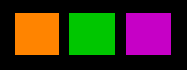
SECONDARY COLORS There are three secondary colors which are orange, green, and violet. Secondary colors are made my mixing equal portions of any two primary colors. For instance red and yellow make green |
![]()
 |
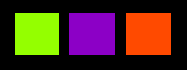
INTERMEDIATE COLORS Intermediate colors are sometimes called tertiary colors. There are six intermediate colors which are yellow-orange, red-orange, red-violet, blue-violet, blue-green, and yellow-green. Equal portions of a primary color and a secondary color next to it make up an intermediate color. Notice that there is a hyphin in the color name and that the primary color is always named first. |
What is Color?
Color is the reflection of white light.
White is reflecting back all the colors while black is obsorbing them. Grey is the mixture of the two, only some of the colors are being reflected back.
If you are looking at a yellow shirt, the chemicals in the dye of that shirt are obsorbing all the colors except yellow. Yellow is being reflected back to you.
COLOR CHARACTERISTICS
Colors have three main characteristics.
*****
Hue: The name of a color
Such as red, yellow-green, or magenta which is a comination of red and red-violet.
*****
Value: The lightness or darkness of a color
Adding black or white can make a color lighter or darker.
*****
Intensity: The brightness or dullness of a color
Adding gray to a color can dull it.
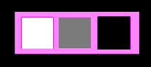
ACHROMATIC COLORS These colors do not appear on the color wheel. We often refer to them as 'non-colors'. These are white, gray, and black. Tint is adding white to a color Tone is adding gray to a color Shade is adding black to a color |
 |
COLOR SCHEMES
Artists will use combinations of colors to create more interesting and pleasing works. Some combinations are used to make you feel uneasy intentionally
![]()
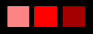
MONOCHROMATIC COLOR SCHEMES This scheme is made up of one color and it's tints, tones, and shades. Here we have taken red. Adding a tint makes it pink while adding a shade makes it wine. These create color values. Value is how light or dark a color is. Adding tone dulls the colors giving it a low intensity. Intensity is how bright or dull a color is. |
|
![]()
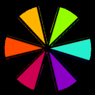
TRIADIC COLOR SCHEMES Triadic colors are three colors at equal distance apart on the color wheel. There are four basic triadic color schemes. You will notice that the primary colors make up one triadic color scheme. The secondary colors make up another. The intermediate colors are browken into two different triadic color schemes. |
|
![]()
ANALOGOUS COLOR SCHEMES This scheme is made of of three or more colors that are adjacent on the color wheel. Adjacent means 'next to'. |

|
![]()
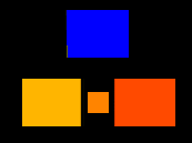
COMPLIMENTARY COLOR SCHEMES Complimentary colors are two colors that are opposite on the color wheel. They tend to be a strong contrast to each other. Mixing two complimentary colors together can give you shades of brown. SPLIT COMPLIMENTARY A split complimentar color scheme is using a color and the two colors adjacent to it's complimentary color. DOUBLE SPLIT COMPLIMENTARY A double split complimentry color scheme is using the two colors adjacent to both complimentary colors. |

|
Color Attributes
Color Temperature:
Warm colors are those that advance towards you and often remind you of warm things. These are yellow, yellow-orange, orange, red-orange, red, and colors made from these.
Cool Colors receed away from you and often make you think of cool things. These are green, blue-green, blue, blue-violet, violet, and colors made from these.
Neutral colors are those made up of both warm and cool colors. These are red-violet, yellow-green, and colors made from them.
Mood of Color
Colors can effect how we feel. Yellow and orange give us energy and are uplifting. Red can make us feel excitement or danger. Violet, blue and green can be very calming. White can make us feel hopeful while black can be mysterious.
Mixing Colors
Earthtones: Mixing complimentary colors will give you various earthtones. For instance in mixing blue and yellow, more yellow will give you lighter golden tones while more blue will give you deep shades of brown.
Sky: You need to add a lot of white for a daytime sky. Adding very small amounts of violet or yellow can change the appearance.
Water: Water is usually seen as blue but it actually has a lot of green in it. If you are painting a stream there will also be browns as reflection from rocks below.
Faces: The pigment in someone's face determines the colors we see. Usually you will start with a lot of white then add a tiny bit of red and a lesser amount of blue. More of these are added depending on how dark the skin of the person you are painting is.
| Fintragh's Homepage | Art Smart | Links & Feedback |
| Properties of Design | Art History | Lessons & Activities |
| Educational Links | ********** | Tidbits |
| Unit: 6 Color | Make a Color Wheel | Paint a Color Scheme |
| 6th Color Quiz | ********** | Color |
09/29/01